

The March edition of Country Living really caught my attention. I mean it really did. Articles from The Great Escape to the Natural Instincts, and the closet turned office (how great was that!), every article was full of inspiration! Not only did the cover catch my eye, but the tag line boasting: "Refresh Every Room" and that was what I am ready to do. Refresh. Refresh. Refresh. Can I refresh every room? Perhaps not, but I can start in the living room. And so I did. I injected a little color (OK, a lot for me) threw in some coastal vibe, and with a few small changes, I was feeling more and more refreshed by the minute.
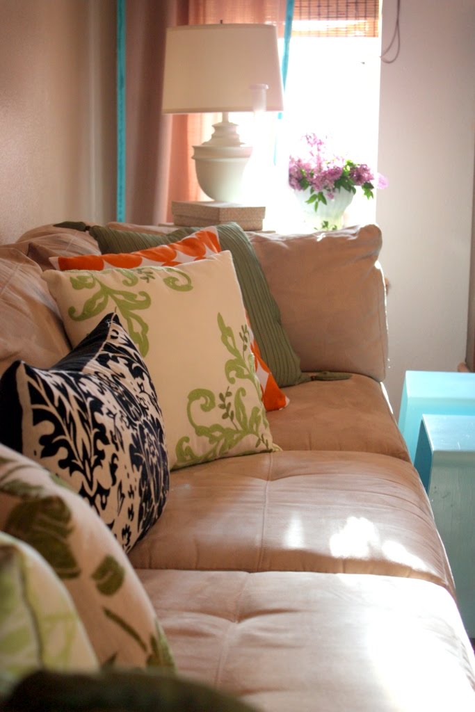
Sometimes making a few small changes can really make an impact. My way of changes come by way of decorative pillows. I can not find an easier way to really add a jolt of color than pillows (aside from paint). They are easy on the wallet and really pack a punch.
I slowly eased out of my neutral safe place, by choosing a color pallet that I love. Green, OK, that's easy for me. I use green in the kitchen and technically green is considered a neutral.
Turquoise, I have been in love with this color for years, I can always use more!
But the color that really got me out of my comfort zone was orange.
I added just a touch, but I am really, REALLY, really loving it.
 I took out my earth tone area rug, while I'm on the hunt for a sea grass rug. Believe it or not, I really thought that not having an area rug would bother me, but it's actually kind of refreshing! Sea grass rug is still on the list, but for right now, I am OK with the bare floor! Also what made a real difference for me is wall color.
I painted the living room recently from a warm gold:

To a cool stone.
This was a huge step for me. I had used this color on the walls for years, there is nothing wrong with it, but I had grown tired of it. I made the leap from the warm yellows, to the other side, of cool stone. I don't think these bright colors would have worked with gold walls.

The pillows are a combination of old and new. Between Walmart and Target, and one from Hobby Lobby. The Orange Circle pillow was at a great price ($4.99) for the cover and I just put in one of my own pillows! Super simple!
The tray was a Walmart purchase, although it did not come this color. In the acrylic/summer/ plastic section, you'll find these round trays in wimpy fading colors. Krylon paint strikes again, this time in Pumpkin Orange. I turned a 5.oo tray into a showpiece! I can't rave about this paint enough!


Fresh lilacs from our garden, in a milk glass vase...not only are they beautiful, but smell so heavenly!

I spray painted a pair of brass lamps that I found at the Goodwill. I LOVE the shape of them and for under $9 a piece, they were mine!
From Brassy:

To creamy dream!


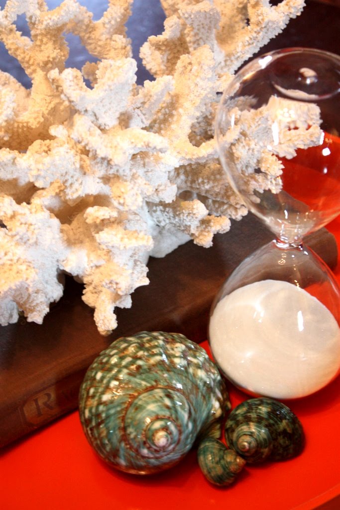
Faux coral, beautiful shells and and hour glass, reminding me it's time to get back NC!!! :)

The garden sphere (Pier 1) looks terrific on the coffee table. Now, if I can only convince Logan it's not a ball!!


All of these accessories are easily changed and rotated. Which is a real sickness of mine. Change. rotate. love it. love doing it.


 A pair of modern hostess tables got a fresh coat spray paint. They were originally an espresso brown, now they look great in turquoise!
I hung a grouping of various artwork above the sofa, most of it inexpensive art, or my own photography. I love the framed coral fern, which is probably one of my best Goodwill finds ever!!

Pillows,

Pillows,

...and more pillows!
 I'm still on the hunt for a couple more orange accessories, and those lamps might see a different color before long, but so far...I love how it's feeling!
Thank you for stopping by! I hope you are inspired!


The new paint color gives you the perfect neutral backdrop to change and rotate until yorur heart is content...over and over :) Love your accessories, especially the GW coral--what a find!
ReplyDeleteBeautiful! I love it. My house is so . . . brown . . . and I'm trying to find colors to liven it up. Gorgeous gorgeous gorgeous, thanks for the wonderful inspiration!
ReplyDeleteGorgeous! and I am a little jealous that you get to actually put things on your coffee table. i wish I could my boys use our coffee table as a race track so anything on there would be a jumping platform or a target to blast off the table.
ReplyDeleteHi Michelle! Oh, your living room looks so beautiful! I love the pops of color you're using! Your picture arrangement is so lovely! You have such lovely things.
ReplyDeleteI'm having my first blog party on May 7th and would love you to come. There's a little pink button on my sidebar that will tell you all about it. I hope you will come.
Be a sweetie,
Shelia ;)
I can't believe you got that coral fern at Goodwill! I've been wanting one of those! I really love the colors in this room. You did a great job refreshing! I love the creamy lamps. I don't think you need to change the color at all. They're gorgeous! I just love everything about this room!
ReplyDeleteYour room is amazing! I, too, love all of the taupey/stone (no yellow based colors please)wall colors...so neutral yet lots of personality. Your picture arrangement is a great focal point (love the coral!!) and the turquoise, orange and green are refreshing. I like to change things out with the seasons, too. You've done a great job Michelle...and you've inspired me to re-do my dining room. Can I ask the actual paint color on your walls?
ReplyDeleteThanks and bravo!
Joyce
Hi Doll! Gotta love a can of spray paint! Krylon is the best!! Loving the lamps especially as I have been thinking of doing that to some of mine. I also am loving your tray!! I just added orange to a painting I did and I pull it into my living room ever fall...what a pop for Spring and Summer! Love your eye for style! Thanks for sharing!
ReplyDeletexo Molly
I love it! I subscribe to that magazine too and it's so cool to see your interpretation of that color scheme.
ReplyDeletewhat a great tranformation! I really love the little orange tray you had painted..a great pop of color on your coffee table.
ReplyDeleteDigging the pillows too!
it's all soooo beautiful!! :) love the color combos!
ReplyDeleteI love what you've done!
ReplyDeleteI'm on the hunt for a large round tray for my coffee table and have been specifically looking at the summer partyware for plastic trays I can mess with. :)
Anyhow, love how you've mixed the patterns on the throw pillows, the new paint color ... it looks so fresh.
i love the orange/green/turquoise combo. those pops of color are so refreshing. i miss nc, too! we lived in asheville in the mountains, and that town will always have a piece of my heart.
ReplyDeleteI sometimes think you can get a bigger bang by changing out the little things, Michelle. Today my decorating refresher was to change out my dining room drapes and valance that were nice and warm feeling for Fall/Winter to linen panels {Target} and some sheers covering about 1/3 of the windows. It really brightens up the room, which extends that light into the kitchen and foyer and it didn't cost me a lot of money either!
ReplyDeleteI came over from SNS and just love your pops of color! I could totally see those lamps in the same orange you used on that tray!! Oh, and I really love the shape of that milk glass vase. I've been wanting to grow lilacs, are they easy? Where did you get the faux coral??
ReplyDeleteGreat updates. Love thew new wall color and the "pops" of orange and turquiose.
ReplyDeleteI have been doing the same thing, changing accessories and freshing up rooms for Spring/Summer! Love your ORANGE!!! And the pillows. The coral fern is a BIG FIND, and an inspiration to me: I have a piece and now I will FRAME IT!!!! XO, Pinky
ReplyDeletewow.. You really did freshen up the room. Those little bursts of colour were just the perfect touches. The room looks very magazine-ish!
ReplyDeleteGreat little changes! Love the idea to paint the acrylic tray. Gonna be hitting Walmart up for one of those tomorrow..
ReplyDeleteColors look great!
AWESOME!!!! Love the pillows on the couch! Come enter my giveaway!!!!
ReplyDeleteI rotate accessories in our home too. It's a sure fire way to not spend so much money on decorating. Your taste, by the way, is exquisite!
ReplyDeleteDi
The Blue Ridge Gal
Looks fabulous Michelle! The color combination is simply stunning. Great job and so inspiring!
ReplyDeleteWOW! The before was nice enough, for sure, but the after? Seriously, looks straight out of a magazine. Makes me want to get to work on my own living room!
ReplyDeletexox,
Susan
p.s. found you via FJI.
What a pretty room! It's all so gorgeous. I love what you did with the lamps and I love your wall art behind the couch.
ReplyDelete~Jennifer
www.studiojru.com
Wow, Michelle! That lamp doesn't EVEN remotely resemble the brassy gold one! I'm in complete awe. I move stuff around constantly. I steer away from orange. But you made it WORK, girl! Your photos are sooo impressive! (And you know how into photos I am.)
ReplyDeleteBrenda
I just found your blog and I really love your blog. I'm a follower now.
ReplyDeleteWhat a beautiful room with great pops of color. I have the same sickness you do, always moving stuff around. You took some great photos.
ReplyDeleteI forgot to mention that Overstock.com has the best prices I have found on seagrass rugs and shipping is only 2.99.
ReplyDeleteHi! I love the new look in your living room. Those colours are beautiful together.
ReplyDeleteThis is awesome...
ReplyDeleteI have those exact same ugly brass lamps stuffed in a closet somewhere but now I think I am going to paint them and use them in my living room. Yours turned out great.
Michelle, Thanks so much for stopping by and linking up to the Sunday Showcase. I'll be featuring your space today. Stop by and grab a featured button if you like. Amazing color - Love it! Hope you have a great week!
ReplyDeleteThis looks great! I love orange and blue together. Thanks for sharing!
ReplyDeleteI love the orange. Looks great.
ReplyDeleteEverything is looking FABULOUS. The orange is THE perfect color for your room. You are so so good at what you do!!
ReplyDeletexo bj
Aqua and coral, turquoise and orange....LOVE IT! Pillows are my passion. GRRREAT JOB! fmp
ReplyDeleteIt looks great!
ReplyDeleteLove all the pillows!
Orange and turquoise are my "go to" colors. It think it came from my mom who painted our house those colors in the 70's but they are still cool!
I have an orange "Keep calm and carry on" poster in my LR. nd other orange and blue accessories.
Thanks for stopping by my blog.
Love yours and I'll be back!
Laura
Awesome job! I was eyeing a couple of those pillows from Wmart the other day! Thanks for stopping by my blog!
ReplyDeleteLove the pop of color..especially the turquoise.
ReplyDeleteYour living room looks so fresh and just stunning. Great pillows too!
Great colors. Very successful. Jane F
ReplyDeleteI love the wall color!
ReplyDeleteI love the photo wall too!!
and the throw pillows.
Okay I love your whole living room!!!
Hi Michelle,
ReplyDeleteFantastic! I love everything you did! How about adding the extra orange to your room on your lampshades? How cool would that be? (or not....)
Anyway,love the room, I'm now convinced it's time to make another change in mine! BTW-we share a name, my middle is Michelle, so's my daughters. It's a great name!!
Stop by for a visit sometime.
XO
Heidi - Heart and Home
You did a great job with the colors, the orange tray is great. Lilacs are my favorite too, I am waiting for ours to bloom!!
ReplyDeleteIt looks gorgeous! Love the blue & orange.
ReplyDeleteVisiting from Under the table and Dreaming...Love those colors! Great job. The blue and orange are an awesome color combo.
ReplyDeleteJust discovered your blog! I love your livingroom...orange and green are my favorite colors!( your pillows are awesome!) I have had my livingroom the same way for 7 years...never changing ANYTHING! I'm so tired of looking at the same accessories..."change and rotate" is not something that comes easily to me! I am inspired by your room! Thanks!
ReplyDeleteWow Michelle! I love this mini-redo! I have a very similar color palette in my living room. I think it gives the perfect coastal relaxed feeling!
ReplyDeleteJess
http://www.ourlifeinhisgrace.tumblr.com
I have been cruzin' through your wonderful blog - I just love it. I am your newest follower!
ReplyDeleteChelsea
Okay, again. Fabulousness. Pure fabulousness. You are a genious. I love every last drop of it. Great job!
ReplyDeleteYou have a beautiful home! So warm and inviting. I'm glad I came to visit your site. I'll be back for sure!
ReplyDeleteThanks for the inspiration.
Have a beautiful day and God bless!
I bought my seagrass rug from Pottery barn for 10% off, because it was a floor model. It's always nice to ask!
ReplyDeleteWow! You have given me an idea that is so easy that it is funny I didn't think of it myself.
ReplyDeleteI have a tapestry hanging above our couch. Always hated it. Now, I will add pictures....
Thanks for the idea!
This is so. so. good. Thanks for breaking down how you did it, too. I am so going to stock up on some krylon paint, I think. It really should be a go-to for fixing/refreshing/reviving!
ReplyDeleteHi Michelle, I'm visiting from Maya's blog link up. That's a gorgeous wall color... like wet sand, perfect background for the touches of turquoise. And your painted lamps are awesome.
ReplyDeleteYou have a very pretty sense of style :-)
I am in love with this post. I just added the teal to my room and happened to put an orange gerber daisy in the room. It popped and looked great. You have inspired me even more to add some orange!! Thank you.
ReplyDeleteSuch an inspiring living room set up. I love balance between the neutrals and the bright pops of color. I've highlighted your room and blog at my Souther Soiree!
ReplyDeletewww.deepsouthernliving.blogspot.com
what is the brand / color on your walls?
ReplyDeleteLove it. I have the same neutral walls and furniture and last year I added orange and lime to mine and I agree, I am totally in love. Your were so creative with your pillow mix and with the wall grouping. Beautiful room. Hugs, Marty
ReplyDeleteI love, love, love this! The colors are inspirational. And my favorite is the lamp re-do! You should join in my Club G.W. (Goodwill!) with Charm Bracelet Diva Party going on right now. This would be perfect!
ReplyDeleteKathleen
Love your use of "random" pillows. I have a large sectional for which I am looking for pillows for the purpose of a fresh new look. I always tend to pick 3 pillows of 2 designs that blend (the same pair in each corner) and place them symmetrically. I wish I had your eye for the "non matching" which looks so much more creative and artsy!
ReplyDeleteLisa